Netdimes project
We want to look at the growth of Autonomous Server (AS) networks found in the netdimes project to see how a network grows over time. In particular, we are looking at nodes in the year 2011. First, let us load the data we have downloaded:
In [8]:
%matplotlib inline
%config InlineBackend.figure_format = 'svg'
import numpy as np
import matplotlib.pyplot as plt
import glob
import pandas as pd
import networkx as nx
from statsmodels.distributions.empirical_distribution import ECDF
import seaborn as sns
sns.set_style('whitegrid')
color = sns.color_palette('bright', 10)
month = ['Jan', 'Feb', 'Mar', 'Apr','May','Jun','Jul','Aug','Sept','Oct','Nov','Dec']
edges = glob.glob('ASEdge*')
nodes = glob.glob('ASNode*')
edgelist = pd.read_csv(edges[0], header=None)
nodelist = pd.read_csv(nodes[0], header=None)
Size
Easy stuff first: let’s look at how the size of the network grows over time. Note that this time period is just one year.
In [9]:
size_nodes = [len(pd.read_csv('ASNodes%s_2011.csv.gz'%i, header=None)) for i in range(1,11)]

fig = plt.figure()
ax = fig.add_subplot(111)
ax.set_xlabel("2011")
ax.set_ylabel("Nodes")
ax.plot(size_nodes, linestyle='-', marker='o', label="Magnitude", color='r')
ax.set_xticklabels(month[:10])
plt.legend()
<matplotlib.legend.Legend at 0xd21c518>
So it appears as if the size of the AS network id more or less decreasing throughout the year. This is interesting, as I’d expect 2011 to be a year of strong growth of the internet. Nonetheless, this is server networks we are looking at, and 10 months is also a short timeframe.
Degree Distributions
We are going to use networkx to assemble the internet network.
We will do this first for one month of the dataset:
In [10]:
fig = plt.figure()
ax = fig.add_subplot(111)
for i in range(10):
    edgelist = pd.read_csv('ASEdges%s_2011.csv.gz'%(i+1), header=None)
    nodelist = pd.read_csv('ASNodes%s_2011.csv.gz'%(i+1), header=None)
    g = nx.Graph()
    g.add_nodes_from(nodelist[0])
    g.add_edges_from(tuple(zip(edgelist[0].values, edgelist[1].values)))
    degree = nx.degree(g).values()
    ecdf_deg = ECDF(degree)
    ax.step(ecdf_deg.x, 1-ecdf_deg.y, label=month[i], color=color[i])
ax.set_xscale('log')
ax.set_yscale('log')
ax.set_xlabel("Degree")
ax.set_ylabel("CCDF")
plt.legend()
<matplotlib.legend.Legend at 0x1209d7f0>
We can zoom in at the middle part:
In [11]:
ax.set_xlim(10,1000)
ax.set_ylim(1e-3, 0.1)
fig
The graphs show that there is a general shift towards the lower left part of the curve as the months go by. This is consistent with the observed decrease in size of the networks. At the same time, the degree distributions of the networks still exhibit power law behavior, which is expected: the degree distribution of the network is a manifestation of the real world behavior of how servers connect to each other.
Clustering coefficient
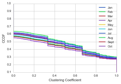
Let us look at the clustering coefficient. This metric will give us an idea how interconnected nodes are as the year progresses.
In [12]:
%config InlineBackend.figure_format = 'jpg'

fig = plt.figure()
ax = fig.add_subplot(111)
for i in range(10):
    edgelist = pd.read_csv('ASEdges%s_2011.csv.gz'%(i+1), header=None)
    nodelist = pd.read_csv('ASNodes%s_2011.csv.gz'%(i+1), header=None)
    g = nx.Graph()
    g.add_nodes_from(nodelist[0])
    g.add_edges_from(tuple(zip(edgelist[0].values, edgelist[1].values)))
    cluster = nx.clustering(g).values()
    ecdf_clust = ECDF(cluster)
    ax.step(ecdf_clust.x, 1-ecdf_clust.y, label=month[i], color=color[i])
ax.set_xlabel("Clustering Coefficient")
ax.set_ylabel("CCDF")
ax.set_ylim(0.1,1)
plt.legend()
<matplotlib.legend.Legend at 0xa7c1748>
Once again, there is a decreasing trend. Since this is a CCDF, we can say that there are a lot more nodes with low clustering coefficients although nodes are decreasing. This might imply that the nodes being removed are those which have a low tendency to form clusters. It makes sense, as you can think of important nodes have a higher tendency to be a part of clusters, and thus servers that are removed in the network are those that are less important.


